Wednesday 12 September 2012

WEEK 6

BAG!


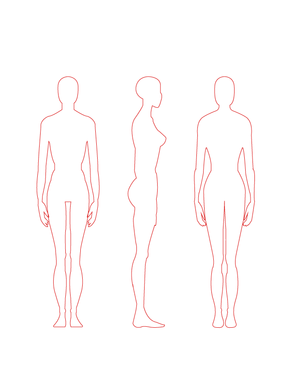
  1. The proved quite easy with the side view being the hardest.
  2. The buckle was constructed using the rounded rectangle tool. 
  3. I outlined most of the objects using the pen tool as they were quite structured and easy to see.
  4. I used the ye dropper on the actual image to get this colour. I added it to my swatches and used the live paint tool to fill the entire bag. 
  5. The rivets i left a silver colour. 
  6. I used a soft brush to highlight the top flap to indicate where the light is coming from. 
  7. The strap was quite long and i got confused as to where is sat so again i used the pen tool and simply outlined it. 
  8. Stitching was larger as the fabric/ material was much denser than any of the fabrics. 
KNIT!


For me, the knit was most challenging as i could not get the braid exactly how i wanted it. 

BRAID:

  1. I first outlined a section of my braid and copied it, trying to keep it fairly symmetrical on both sides.
  2. I then rotated it horizontally and created a square with no fill or stroke in the centre of the first and second braid.
  3. I sent this square to the back and selected all of the objects and dragged it into brushes.
  4. Now when i created a line with this brush selected, a whole string of braids appears.
  5. Sometimes it wouldn't connect properly to the hem or neckline and so i had to go in with the pen tool carefully (0.25) and attach it properly.


RIBBING:


  1. To create the ribbing, outlined my section again in the pen tool and dragged it over to the side.
  2. I then selected the pen tool and selected a dash of 40pt in a fill of grey, no stroke and dash width of 1 and gap of 2. 
  3. I was then able to create a curved pen line in the direction of my object/ shape where the ribbing went in the direction of the fabric.
  4. When I had placed the ribbing in correctly i used the clipping mask took in the 'OBJECTS' menu to cut it out and place back in the image.
  5. I then sent this to the back so that the black, detailed lines and outlines were visible. 

WEEK 5

JACKETS!


  • The jacket was quite challenging as there was a lot of detail but i felt it was right to challenge myself.
  • This particular jacket had quilting on both the arms and the yokes, created through dashed pen tool lines that were curved to show the roundness of the arm.
  • The zip was created using the brush as the skirt as it was also metal toothed going across one side of the centre front. 
  • It was really important to show all panel lines especially the princess panel lines, demonstrating how the garment falls on a figure.


  • The split pockets sat either side of the two centre panel lines and it was important to leave enough space otherwise they would not have fit and the whole garment would not look proportionate. 
  • A lot of fine top stitching was used over all the seams as the leathery fabric is quite tough and needs to be secure.
  • The arm seam can only be seen from the back. 
  • Using the rulers (found in 'VIEW') has been very helpful to getting the seams right on both sides and making everything symmetrical, otherwise the result would not look as polished. 


WEEK 4

SHIRT!


I chose to fold one arm to demonstrate more detail and feel for the fabric. 

  • I have created gather lines at the cuff and a simple one button cuff. 
  • The back was highly interesting with cutouts. I created these through the rounded rectangle tool. the bows were created through the pen tool and basic pen lines for added gathering.


  • The dress pocket was interesting with double top stitching and a slightly pointed flap hem. 


The'candy man' style stripe was created through the rectangle tool:


  1. I first created one thin red rectangle with no stroke and selected 'option' and 'command' to drag and copy it along. 
  2. I then pressed command 'd' to repeat my last action and did so until i had 6-10 strips
  3. I selected a square using the rectangle tool with no stoke or fill. 
  4. I sent this to the back and added it to my pattern. 
  5. I then placed the pattern inside specific shapes and i could change the way they fell on the design by selecting 'OBJECT' > 'TRANSFORM' > 'ROTATE'  and unchecking objects and leaving the pattern i was now able to make the lines go in the directing of my fabric. 


WEEK 3

DRESS!


Tucks and crease lines were a bit tricky to do but can be created through the pen tool:

  • Choose a low stroke such as 0.25 and click FROM a point for tucks a most creases. For the next anchor point, place in the direction you would like it to go but use the handles to create a small curve at the end where it tucks. 
  • Stitching lines have been created at 0.5 stroke and dashes of 1pt with a gap of 2. 
  • For side views you really have to indicate every detail for example the split in the hem, a slight hint is shown to add interest and to make it look more professional. 
  • Shadowing has been created with the live paint bucket by selecting the area and fill. This helps to show the contrast in the right and wrong side of the fabric. 


SKIRT!


The skirt was challenging as it had a metal tooth zip which i had to create a brush for. 
  • The asymmetrical nature meant that it couldn't be reflected.
  • The zip wraps around the side, back and front of the garment. 
  • There is some crunching of fabric at the back accentuated by fine pen lines. 


ZIP BRUSH:


  1. Find zip image and trace ONE tooth. 
  2. Fill with any colour or leave blank. Reflect it horizontally and place side by side so the teeth fit inside each other. 
  3. Place a rectangle from the centre point of the first tooth to the centre point of the last one with no stroke or fill.
  4. Send this to the back and drag everything into the brushes pallet. 
  5. Select patterned brush and name. 
  6. Use the pen tool to create a line then click on this specific brush and a line will appear with your brush. 


SHORTS


SHORTS!


For my shorts I simply used the pen tool to trace the basic shape and reflected the same shape on the other side by going into 'OBJECT' > 'TRANSFORM' > 'REFLECT' > Then make sure 'verticle' is checked and then press 'COPY' which will create a reflected copy of your selection. 

POLKA DOTS!

Diagonal polka dots:

  1. Create a square using the rectangle tool with no stroke and any fill colour.
  2. Create a circle using the elliptical tool holding down shift and also with NO stroke. Place it at the top centre point where it will state: 'intersect
  3. Copy and paste the circle and drag one to the opposing side and each other side at the centre, half on, half off. 
  4. Then place a square with no fill or stroke over the square and send to the back.
  5. Select both the square and all objects and drag into swatches.
  6. Now when you click an object and fill with this swatch, diagonal polka dots should appear 

To change the scale simply go to 'OBJECT' > 'TRANSFORM' > 'SCALE' and change to a lesser number such as 90. All of the dots will decrease in size. Because this was your last action press 'control' and 'd'to repeat and make them smaller again. To make them larger just change the increment to a higher number such as 110. 


BUTTON!

  1. Use the elliptical tool by holding down the 'SHIFT' key to create a perfect circle. You can change the stoke that you are using depending on the design.
  2. Next use the pen tool to create an arrow on the side indicating weather the button hole is vertical or horizontal.
  3. You can select multiple shapes by holding down the shift key and selecting them in order to move specific shapes together across your page. 


Wednesday 15 August 2012

Shorts/pants week 2


Images sighted from asos.com


Pen tool on Illustrator

Use the pen tool to trace around shapes and create shapes. Simply click where you would like to start, then click again where you want the line to follow. NOTE: you can bend the line and curve the line at different points depending on where you move the handles. You must click back on the previous anchor point to continue the line. You can pivot, cut and add anchor point to your shape using the tools in the sidde bar menu. 

Tuesday 29 May 2012

Week 10 - Rendering Body


Week 10

  • Swatch pallet – Pick a pinky/ orange skin tone and add colour top swatch so you don’t loose colour
  • Don’t just have FLAT colour- have to render light and shade
  • Burn tool makes darker
  • Dodge takes colour out
  • Use SOFT brush
  • 30% and 19% so it doesn’t look like brush strokes
  • keeping in mind where light is coming from
  • dodge and burn tool also add shading on garments.


Another technique:
Figure with skirt

  • create new layer – white background
  • Put underneath outline
  • Contiguous off > select outside then inverse> white >paint bucket whole figure
  • different layers for different coloured rendering
  • new layer called skin
  • Use multiply for skin layer
  • use brush to render in skin colour
  • dodge and burn


face

  • take out eye colour create new layer
  • change layer mode to multiply
  • blur and soften> filter> blur> Gaussian Blur> play with radius
  • blush-pinky
below i have also used a thin brush to create a fur-like textured bodice. The hair has been dodged and burned in terms of where the light hits teh figure.


 Fashion illustrations that inspire me:


 -Use of watercolour 
- Thin line work
- Heavy shadowing 
- All black
- Slightly realistic
- Not a whole or finished body
- Shows off the garment details- feathers, tulle
-Hand drawn and digitally altered - more shadowing, watercolour brush giving more depth
(2011. Rhodin, Cassandra. 'Inspiration: Fashion Illustration Art' <http://thepolyvorina.blogspot.com.au/2011/04/inspiration-fashion-illustration-art.html> Accessed 20/5/12)


- Use of texters
- Vibrant colour
- realistic figures with right proportions
- Heavy detailing - get a real sense of the texture of the fabric 
- movement of bodies
- figures interact 
- brightness or contrast enhanced and figures placed together - fashioned on photoshop perhaps.
(2009. Donovan, Bill.
'Why Fashion Illustration is In, and Photography Out'
<http://fashiontribes.typepad.com/fashion/2009/04/why-fashion-illustration-is-in-and-photography-out.html> Accessed 20/5/12)


- Not the whole body shown
- Exaggerated hair 
- Maybe a use of a brush to get the feathered effect
- intense shadowing to give a soft texture.
-deep blacks used.
-heavy makeup- red lips, dark eyes.
- good body language - very suggestive from a marketing point of view. 
(2010. Tinoco, Luis. 'Examples of Great Fashion Illustrations' <http://www.designer-daily.com/20-examples-of-great-fashion-illustration-10551> Accessed 20/5/12)


- Amazing, unrealistic, moving hair
- as though the figure is swimming or caught in a wind.
- Billowing fabrics are echoed through the hair.
- Black and white use only- get a real sense of the texture from her use of light and shade/ tone.
(2010. Laine, Laura. 'Examples of Great Fashion Illustrations' <http://zoe-in-wonderland.blogspot.com.au/2009_12_01_archive.html> Accessed 20/5/12)
My attempt at my 
- I drew a simple shape with art line pens


- I then used a watercolour brush to add in hair, shadow and the graceful, balletic fabric.
- The make up i placed on teh figure was quite heavy- red lips, dark eyes and eye shadow- and was achieved through brush techniques and the paint bucket.