Week 10
- Swatch pallet – Pick a pinky/ orange skin tone and add colour
top swatch so you don’t loose colour
- Don’t just have FLAT
colour- have to render light and shade
- Burn tool makes darker
- Dodge takes colour out
- Use SOFT brush
- 30% and 19% so it doesn’t
look like brush strokes
- keeping in mind where
light is coming from
- dodge and burn tool also add shading on garments.
Another technique:
Figure with skirt
- create new layer – white background
- Put underneath outline
- Contiguous off > select outside then inverse> white >paint bucket whole figure
- different layers for different coloured rendering
- new layer called skin
- Use multiply for skin layer
- use brush to render in skin colour
- dodge and burn
face
- take out eye colour create new layer
- change layer mode to multiply
- blur and soften> filter> blur> Gaussian Blur> play with radius
- blush-pinky
below i have also used a thin brush to create a fur-like textured bodice. The hair has been dodged and burned in terms of where the light hits teh figure.
- Thin line work
- Heavy shadowing
- All black
- Slightly realistic
- Not a whole or finished body
- Shows off the garment details- feathers, tulle
-Hand drawn and digitally altered - more shadowing, watercolour brush giving more depth
(2011. Rhodin, Cassandra. 'Inspiration: Fashion Illustration Art' <http://thepolyvorina.blogspot.com.au/2011/04/inspiration-fashion-illustration-art.html> Accessed 20/5/12)

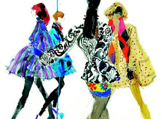
- Use of texters
- Vibrant colour
- realistic figures with right proportions
- Heavy detailing - get a real sense of the texture of the fabric
- movement of bodies
- figures interact
- brightness or contrast enhanced and figures placed together - fashioned on photoshop perhaps.
(2009. Donovan, Bill.
'Why Fashion Illustration is In, and Photography Out'
<http://fashiontribes.typepad.com/fashion/2009/04/why-fashion-illustration-is-in-and-photography-out.html> Accessed 20/5/12)
- Not the whole body shown
- Exaggerated hair
- Maybe a use of a brush to get the feathered effect
- intense shadowing to give a soft texture.
-deep blacks used.
-heavy makeup- red lips, dark eyes.
- good body language - very suggestive from a marketing point of view.
(2010. Tinoco, Luis. 'Examples of Great Fashion Illustrations' <http://www.designer-daily.com/20-examples-of-great-fashion-illustration-10551> Accessed 20/5/12)
- Amazing, unrealistic, moving hair
- as though the figure is swimming or caught in a wind.
- Billowing fabrics are echoed through the hair.
- Black and white use only- get a real sense of the texture from her use of light and shade/ tone.
(2010. Laine, Laura. 'Examples of Great Fashion Illustrations' <http://zoe-in-wonderland.blogspot.com.au/2009_12_01_archive.html> Accessed 20/5/12)
My attempt at my
- I drew a simple shape with art line pens
- I then used a watercolour brush to add in hair, shadow and the graceful, balletic fabric.
- The make up i placed on teh figure was quite heavy- red lips, dark eyes and eye shadow- and was achieved through brush techniques and the paint bucket.


No comments:
Post a Comment